Figma to SharePoint - Modern Learning Landing Page
Updated: Apr 16
This project explores how a modern learning landing page can be designed using a combination of SharePoint’s flexible layout capabilities and custom visual systems created in Figma. The goal was to create a clean, intuitive, and visually engaging experience that helps users quickly understand where to start, what’s available, and how to navigate learning pathways.
Current State
In the hero section the first phase would use a simple quick links part to display the learning pathways:
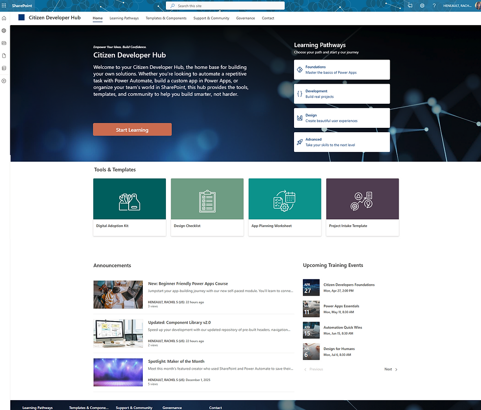
Future State
In the next phase the concept for the Learning Pathways component ideas:
Displays pathways based on the user and their interest
Pathway will show a progression bar
If a pathway is complete an award bar will display for a week before a new pathway appears.
(Design concepts to follow, below are the first pass concepts)

Establishing the Structure: Header & Footer Navigation
I began by defining a consistent navigation pattern in both the header and footer. This creates a sense of system‑level cohesion and ensures users always have access to core areas of the site. The nav uses a clean, minimal structure that aligns with modern intranet patterns and supports scalability as the site grows.
Design Intent:
Provide predictable navigation
Reinforce brand identity
Create a reusable pattern for future pages
Hero Section: Clear CTA
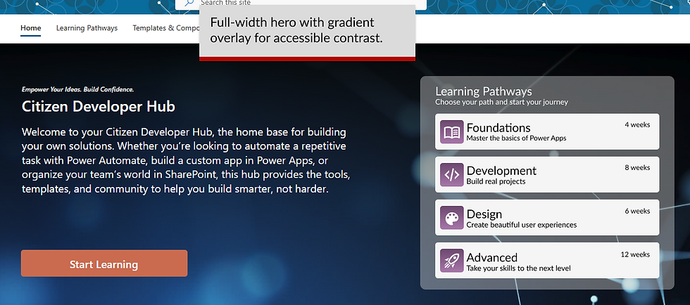
The hero uses a flexible layout with a full‑width background image and a subtle gradient overlay to ensure text readability. The left 50% contains an H2, supporting text, and a primary CTA (“Start Learning”). The right 50% is reserved for a custom Figma‑designed learning pathway quick launch.


Learning Pathways: Custom Figma Component System
Instead of relying on default SharePoint cards, I designed a four‑pathway quick launch in Figma. Each pathway uses a custom icon, a distinct brand color, and a consistent card structure.

Quick Links Section: Branded Card Grid
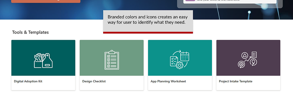
The next section includes four quick links, each represented by a custom icon and a brand‑aligned color. This creates a micro‑identity for templates and tools, helping users quickly identify what they need.
Announcements + Events: Two‑Column Information Hub
This section uses a split layout:
Announcements with stock photography for visual interest
Events with upcoming training dates



Comments